The full cost of a GOV.UK rebrand which saw changes made to a full stop has been revealed, after civil servants spent over half a million pounds on what's been described as a 'vanity' makeover.
The new look is accompanied by a 150-page dossier released by civil servants in Whitehall, with the expansive document outlining the ways to correctly use the newly designed full stop.
The staggering total left many questioning whether the redesign constituted taxpayer value for money.
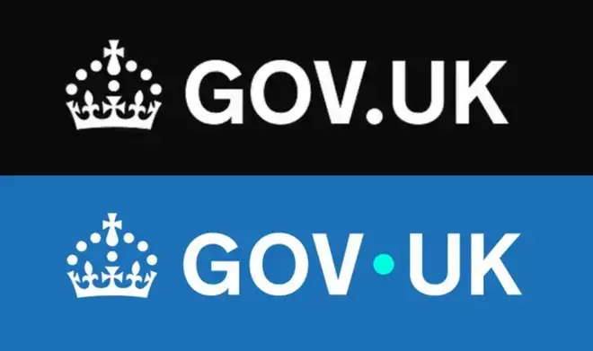
Showcasing the new look, the gov.uk site – which provides advice on essential services including tax renewals and passports – has bid farewell to the black and white logo in favour of the new blue design and turquoise 'dot'.
The redesign forms part of a 'brand refresh' undertaken by global ad agency M&C Saatchi, with the final cost of the contracts reportedly totalling £532,000.
The Whitehall communications accompanying the redesign detail expansive “brand guidelines”, with the new look described as a “concept” capable of acting as “the bridge between government and the UK, by the side of users to help make information and services easier and more useful”.
The guide continues: “Used within our wordmark and as a graphic device across all GOV.UK channels, the dot is a guiding hand for life.”
The logo redesign, which went live a matter of days ago after being unveiled earlier in June, has been criticised by many for being "tacky" and "cheap", with some left questioning why someone was paid "to move a dot".
The 150-page accompanying guide was mocked for its length, with recent dossiers including the government's Strategic Defence Review (144 pages), National Security Strategy (55 pages) and Chagos Islands deal (37 pages) paling in comparison.
The dossier also outlines how the dot could be used to depict "a coin being placed into a piggybank".
The accompanying dossier explains that "the dot can take on different roles – guiding users through content, journeys and experiences across GOV.UK channels,” it says. “It should always serve a clear purpose.”
Figures including Zia Yusuf, head of Reform UK's efficiency drive, slammed the "revamp", branding the redesign a public waste of money.
"The disrespect for taxpayers' money continues to be astounding," he said following the unveiling.
"Spending more than £500,000 on changing a logo on a government website is a joke at the taxpayer's expense, quite literally.
"This is just the kind of thing we have been uncovering in county halls on a daily basis. It's abundantly clear that Whitehall also needs a visit from Reform's DOGE team."
The previous Conservative government tendered two contracts for the brand resign, which has been carried on under Labour – according to publicly available papers.
It's understood that M&C Saatchi landed deals potentially worth up to £750,000.
The final bill reportedly came to £532,000, with the cost drawn from existing department budgets – according to a government source.
On an online forum, one civil servant said: "As a government we are trying to maximise efficiency and save money.
"Why was this what we chose to spend time and resources on?"
Elliot Keck, campaigns chief at the TaxPayers' Alliance, told the MailOnline: "Taxpayers will be baffled that hundreds of thousands have been blown on minor graphic design changes.
"At a time when public services are stretched and families are feeling the pinch, shelling out for a vanity rebrand is an insult to hardworking Brits.
"Ministers should be focusing on delivering frontline services, not petty optics."
However, officials defended the splash of cash, outlining the six-figure bill included 'refreshing and extending' the Gov.UK brand across web, mobile and app platforms.
A government spokesman said: "This was committed to by the previous government, with two of the three contracts signed and delivered by July 2024.
"The new government then chose to turn the rebranding and research work into consumer-friendly digital products, including our upcoming gov.uk App, gov.uk Chat and more."
In a royal rebrand last year, the St Edward’s Crown used under Queen Elizabeth was swapped for King Charles’s chosen Tudor Crown in the logo.
